Blue Men Plumbing
A website and quoting platform for a GTA plumbing company, built on one idea: tell the price first.
- Role
- UI Designer & Developer
- Tools
- Tailwind CSS, shadcn/ui, Next.js, Supabase
Problem
Homeowners hate calling a plumber because the price is a mystery until someone's already standing in the kitchen. Most trade sites lean on stock photography and a single 'Contact Us' form, which does nothing to solve that anxiety. Blue Men Plumbing needed a site that could sell trust and price transparency before a single call was made, and a back office simple enough for a two-person crew to actually run.
Process
1 / 6
A hero that talks about price
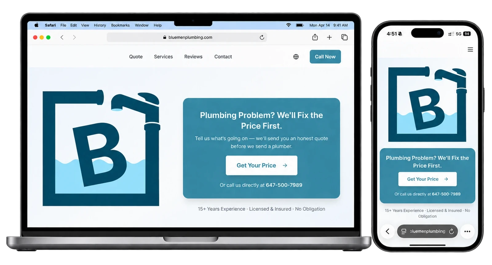
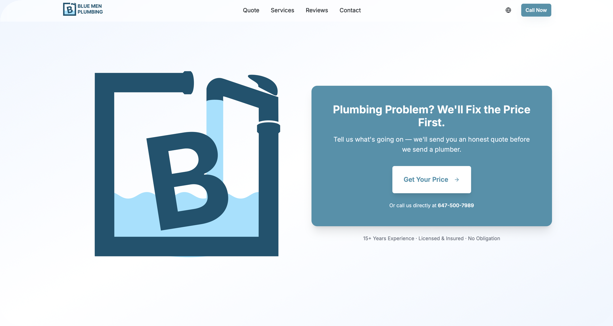
Most plumbing sites open with a truck photo and a phone number. This one opens with a promise, that the price gets sorted out first, and gives the visitor one big button to act on. The logo sits beside the offer so the brand and the pitch share a single screen, and the phone number stays visible for people who would rather call.
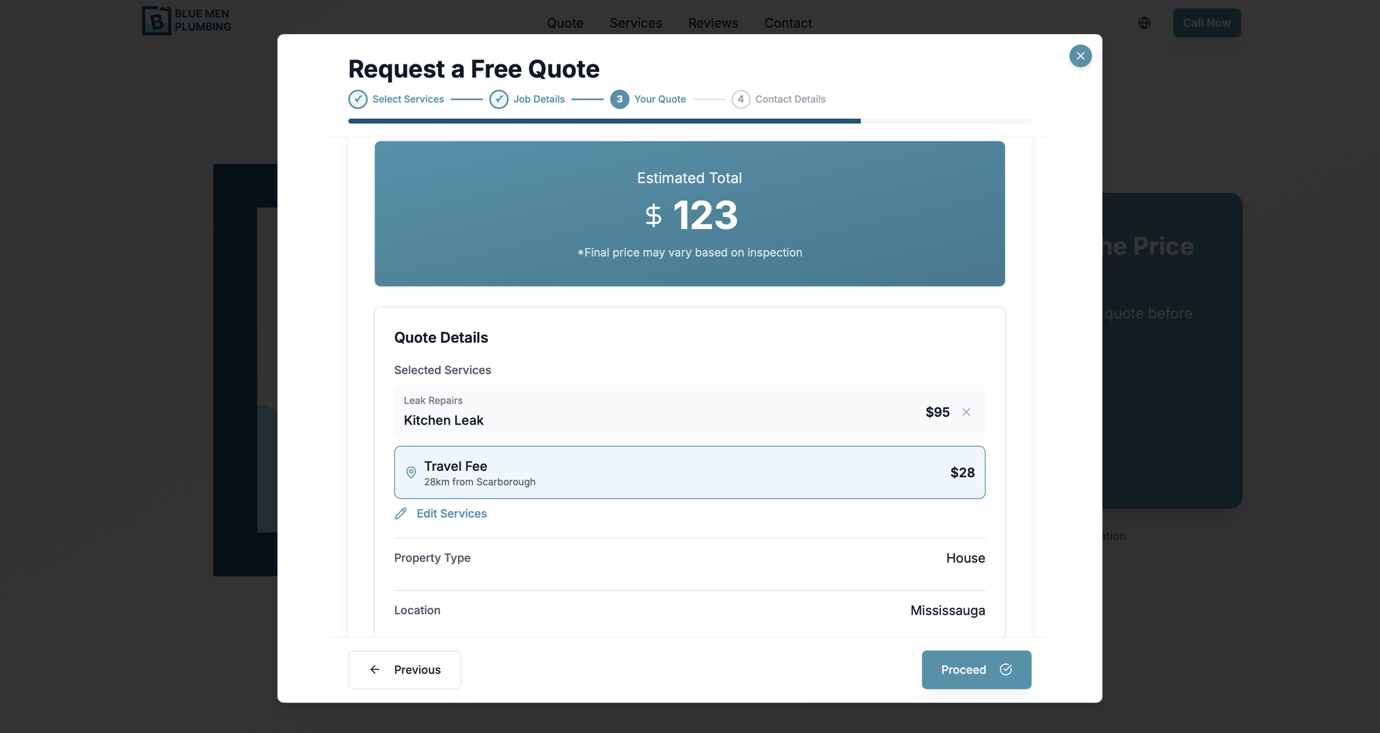
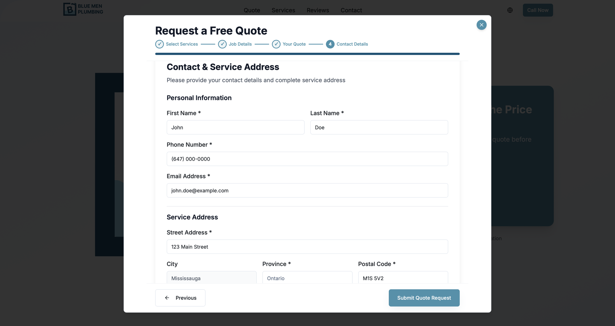
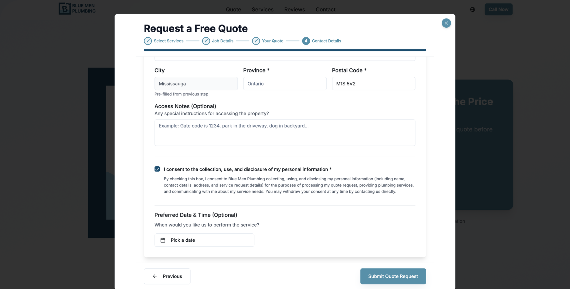
On mobile
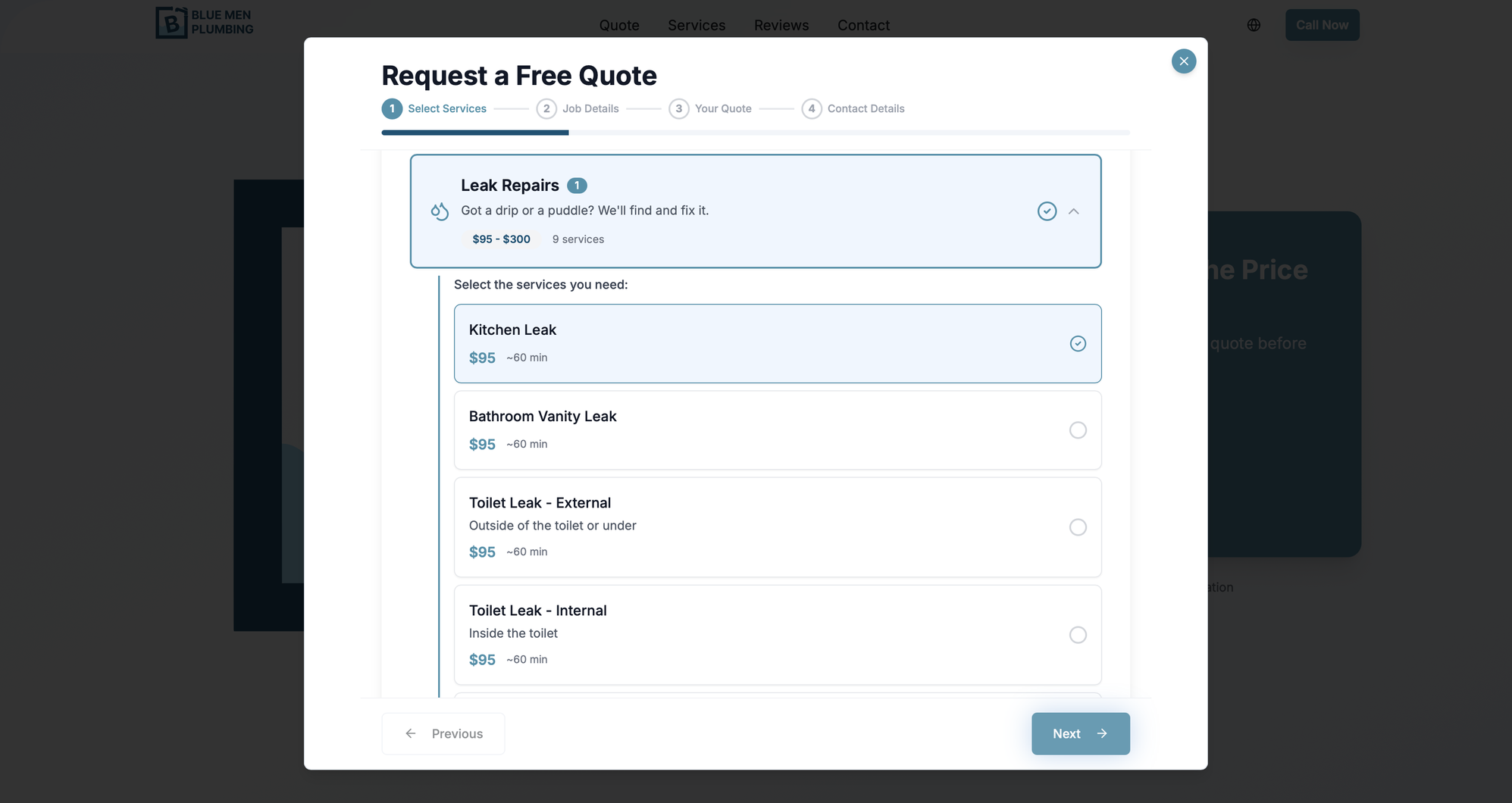
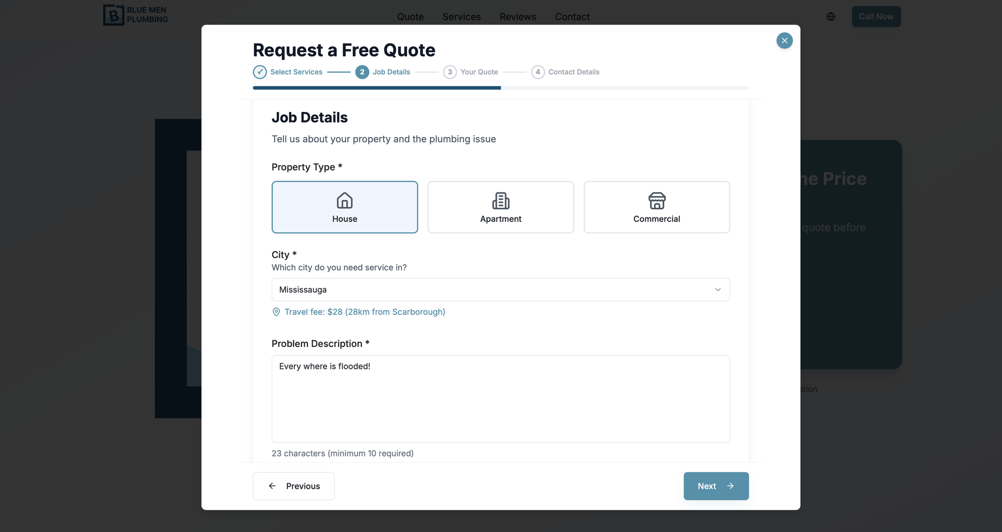
On a phone the site keeps the same promise with a different layout. The logo and the price offer stack into one column, and a Call Now and Free Quote bar stays pinned to the bottom of the screen for the whole scroll, so both actions are always in thumb reach. Photos and facts drop into two column grids that are easy to skim, and the quote wizard becomes a full height sheet where services collapse into tappable categories with their price ranges shown up front.
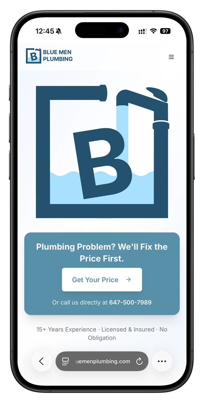
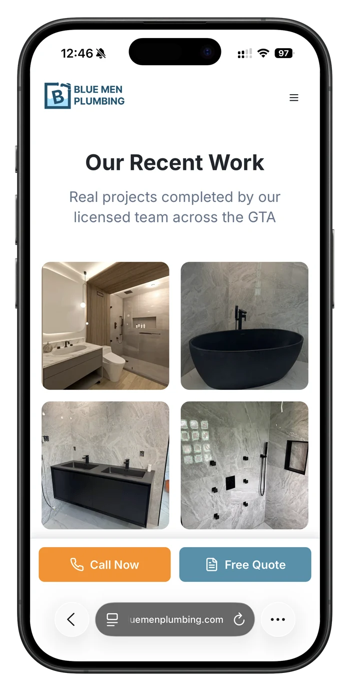
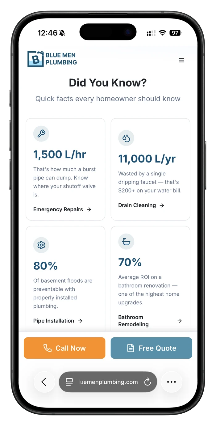
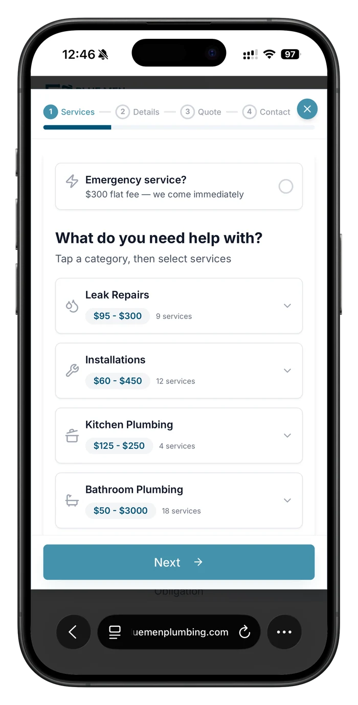
UX flow
Four steps from “Get Your Price” to a submitted request, with a phone shortcut for anyone who'd rather just call.
Logo
I designed the Blue Men Plumbing mark myself, and it's the seed the rest of the site grew from: the blues, the roundness, even the tone of the copy all trace back to it. It had to read instantly at favicon size and still hold up as an animated hero.

A B you can read at a glance
One bold, slightly tilted capital B inside a square frame. The tilt keeps a rigid letterform from feeling corporate, and a single letter survives shrinking down to a browser tab.
The trade, drawn in the frame
The frame's top edge turns into a pipe on one side and a faucet spout on the other, so the box reads as plumbing before anyone reads a word.
Water that fills the letter
The B sits in a rising pool of light blue, and that's what the animation plays with, the same idea as the site's promise: something concrete you can watch happen, not a vague claim.
Color palette
Brand blue reused straight from the logo, warmed up with a cream neutral so a trade site doesn't feel clinical.
Ocean Blue
#005275
Primary: logo, CTAs, headers
Bright Blue
#007ACC
Gradient end, hover glow
Water Teal
#4493AB
Accent, icon fills
Mist
#F1F5F9
Card + section backgrounds
Warm Cream
#F8F1ED
Hero gradient: softens the cool palette
Outcome
Shipped and live on Vercel, actively taking real quote requests from GTA homeowners. The two-tier service/pricing model and the quote wizard's data shape now double as the admin dashboard's editing surface, so updating a price on the site updates the quote calculator for free: one source of truth instead of two systems to keep in sync.