Pro Edges Painting
A bold brand and marketing site for a Halifax painting crew, built to prove the work, not describe it.
- Role
- UI Designer & Developer
- Tools
- Tailwind CSS, shadcn/ui, React, Vite
Problem
Halifax has no shortage of painting contractors, and almost every one of their sites looks the same: a truck photo, a phone number, a vague promise of quality. Homeowners can't tell a careful crew from a sloppy one before they've already let someone in the door, and a paint job can't be quoted instantly the way a small repair can: someone has to see the walls first. Pro Edges needed a site that made craftsmanship visible up front and turned its own tagline, "Sharp lines, solid work," into something you feel scrolling, not just read.
Process
1 / 4
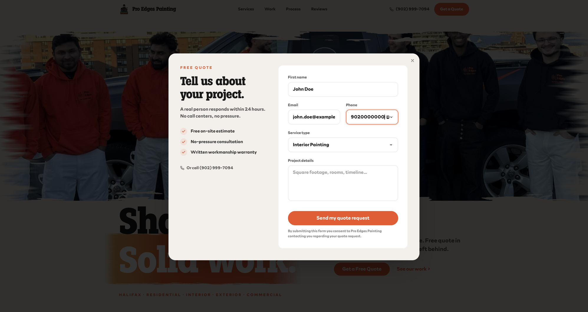
Sharp lines, solid work
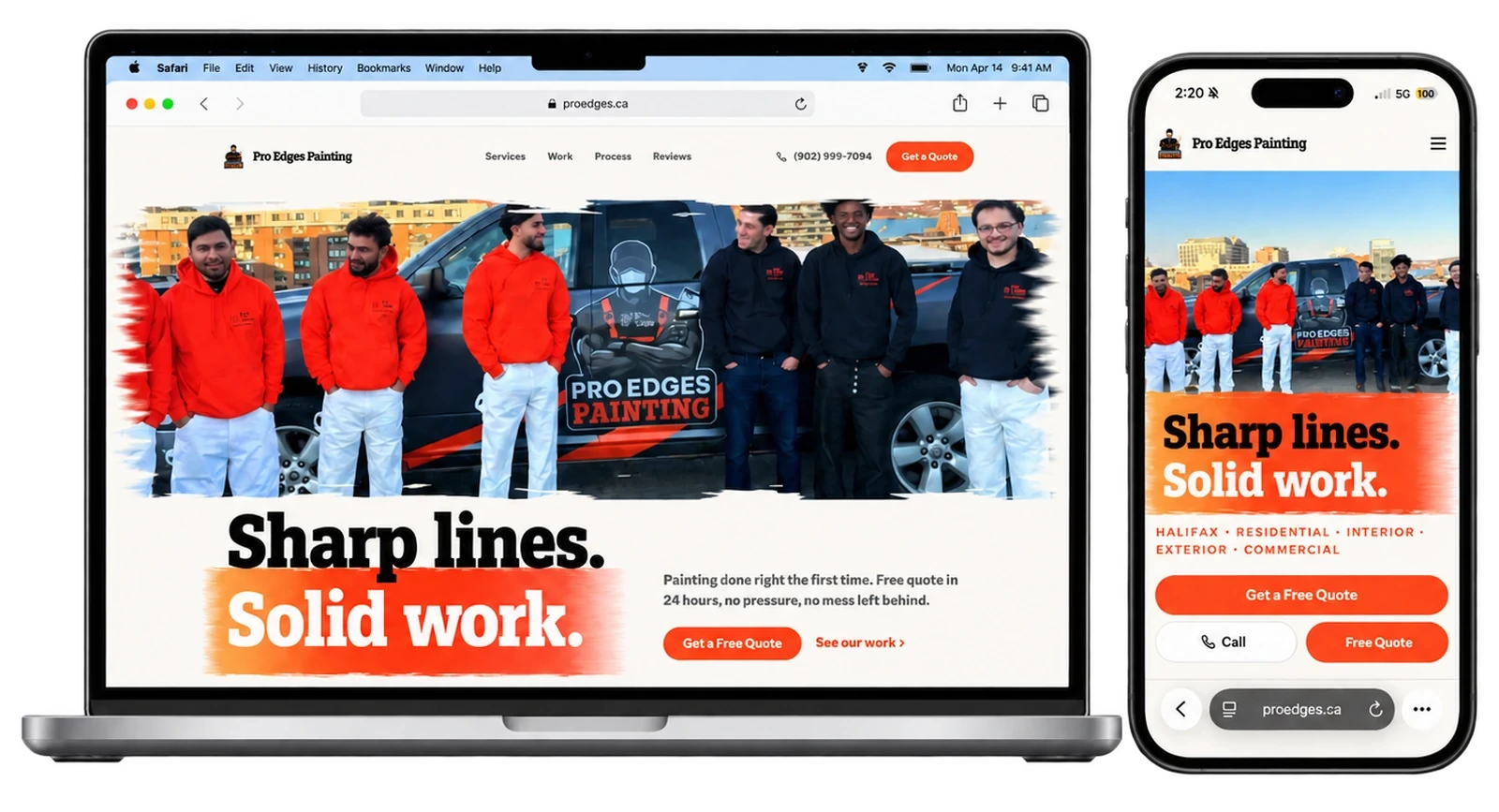
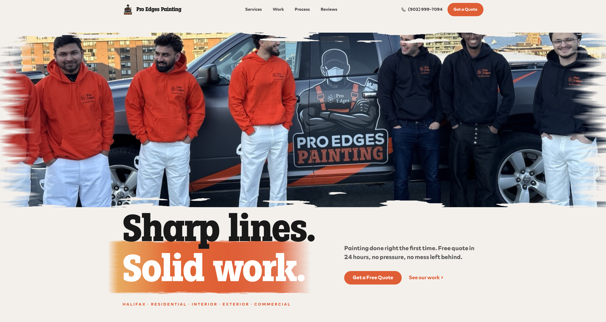
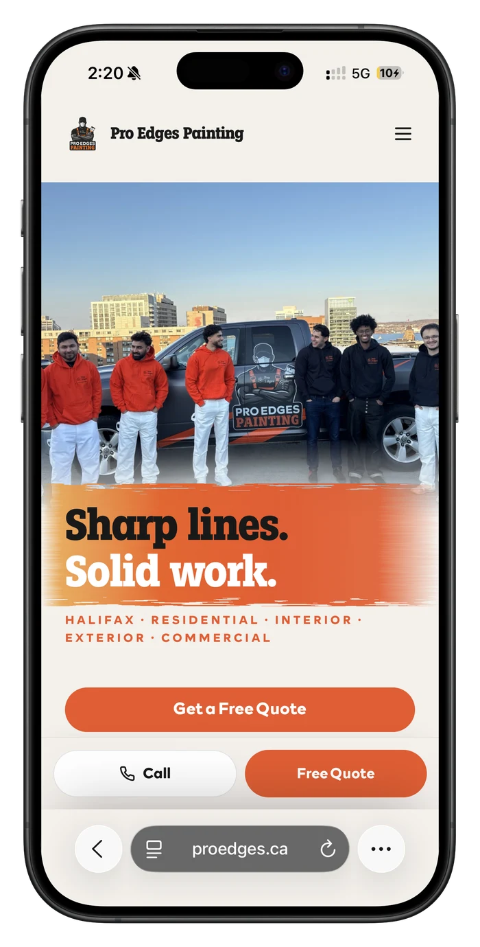
The tagline is the whole visual system. Oversized slab type sits under a hero photo of the actual crew and truck, and the photo's edges are torn like a brush stroke instead of cut square. The words Solid work sit on a painted orange swipe. The primary button and a quieter See our work link give the visitor a clear first move.
On mobile
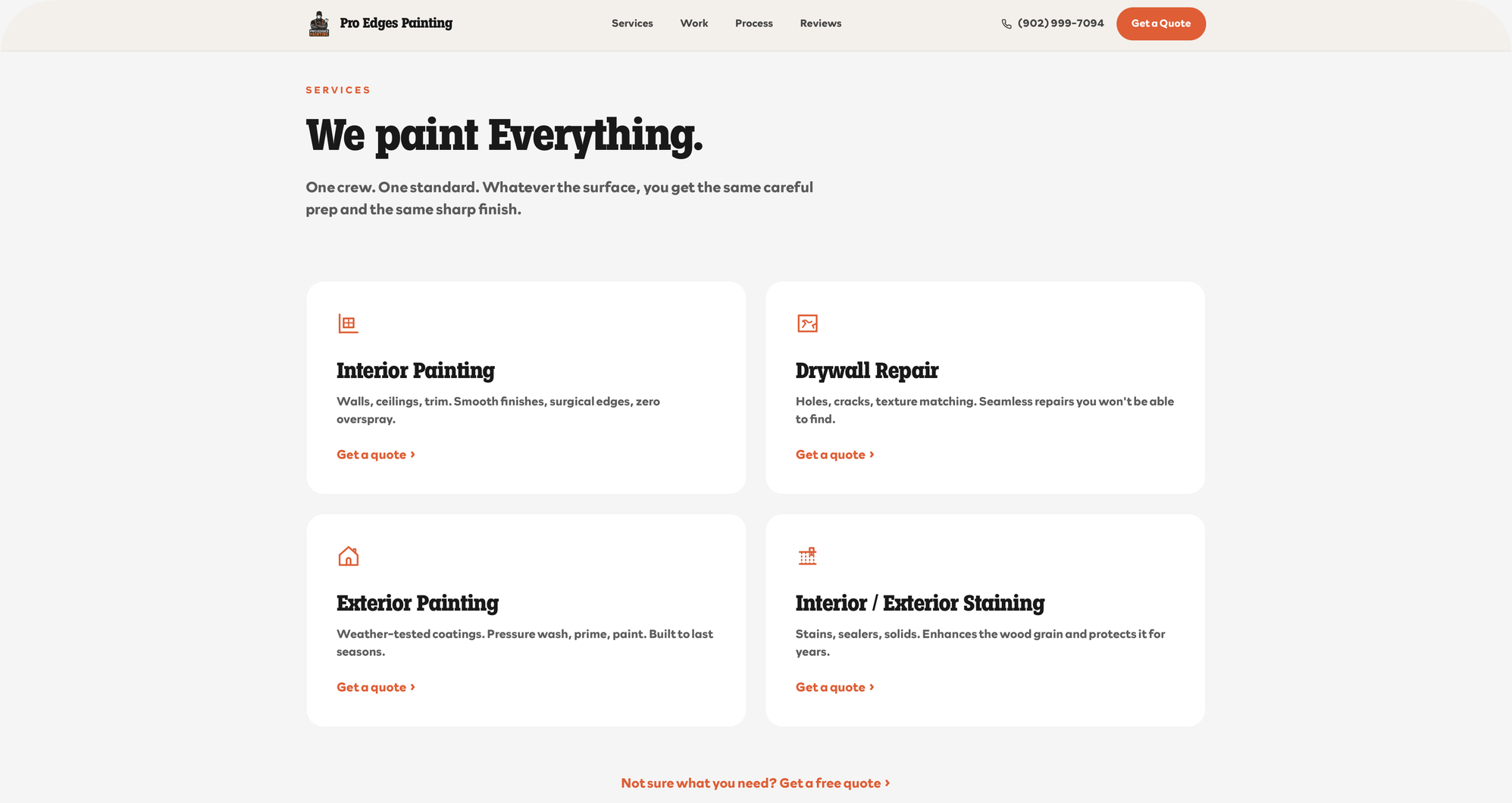
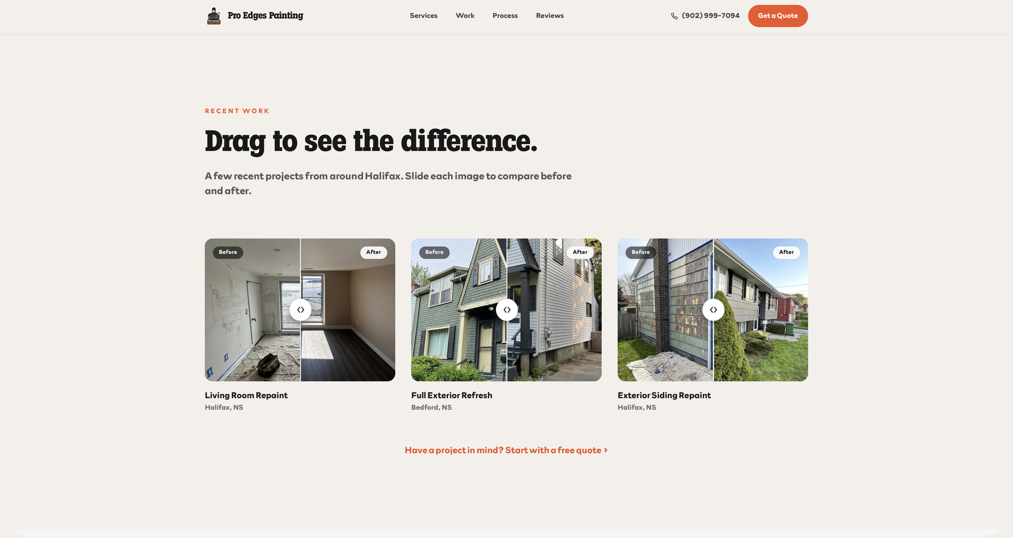
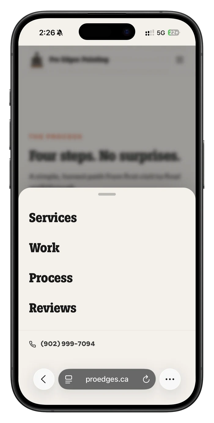
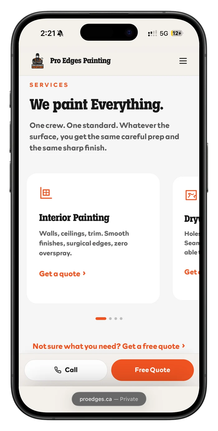
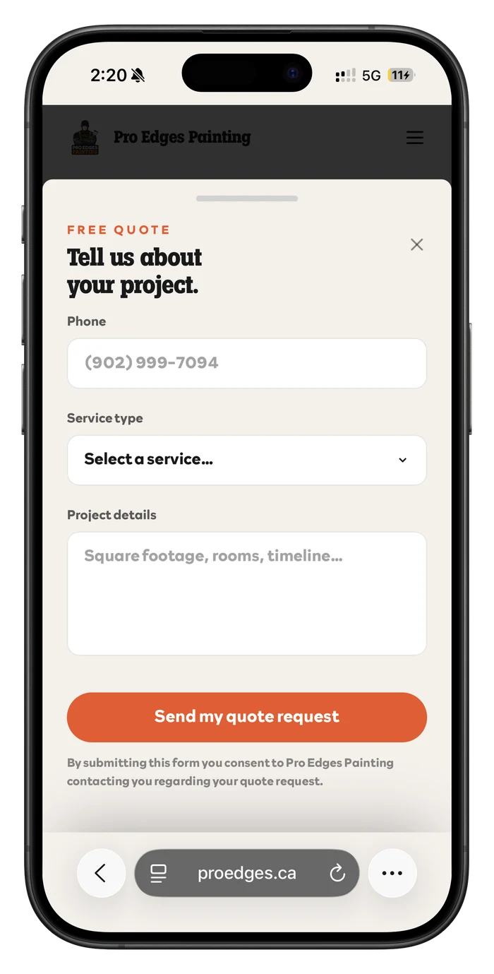
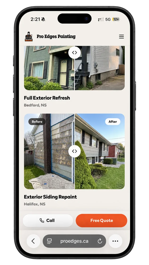
Nothing here is a shrunk-down desktop page. The hero keeps its sticky Call / Free Quote bar within thumb reach for the entire scroll. Services become a swipeable, peeking card carousel with dot pagination instead of a cramped grid. The nav menu and the quote form both open as the same bottom sheet with a drag handle (one interaction learned once, reused twice) so getting around never means reaching for the top of the screen. And the before/after comparisons still take a real finger drag, exactly like a mouse drag on desktop, with no fallback tap-to-toggle needed.
UX flow
No login, no account: a straight line from landing to a submitted quote request.
Color palette
One confident orange against warm off-white and near-black: loud enough to feel like a brand, restrained enough to still look like a professional trade site.
Signal Orange
#F15323
Primary: CTAs, brush-stroke accents
Charcoal
#1A1A1A
Headlines, mascot linework
Ember
#DD3E0E
Hover / pressed state
Off-white
#F4F0EB
Background: warm neutral
Slate
#2E2E2E
Secondary dark surfaces
Outcome
Live in production for a real Halifax painting crew. The brand system (oversized type, the brush-stroke motif, the before/after proof) repeats identically across hero, gallery, and quote flow, so the site reads as one confident voice instead of a stitched-together template. And the before/after slider gives the crew a page they can text a prospective customer instead of describing the work over the phone.